
Tired of sifting through spreadsheets and lengthy emails to understand what’s really happening? Picture a workplace where the pulse of operations – project status, potential bottlenecks, and crucial performance indicators – is instantly visible. This isn’t a utopian dream, but the tangible outcome of implementing a Visual Management System within a Lean framework. Given that our brains are wired to process visual information with remarkable speed and efficiency, leveraging this natural ability can revolutionize how teams communicate, collaborate, and drive improvements.
This article is a practical guide for managers, team leaders, and continuous improvement practitioners eager to unlock the power of visual communication. We will move beyond the theory and dive into real-world examples of visual management tools used in Lean environments, illustrating their impact on transparency, problem-solving, and overall efficiency. Furthermore, we will provide actionable insights into how to effectively implement these systems within your own organization, transforming data overload into clear, actionable insights that empower your teams and accelerate progress.
Main Takeaways From This Article:
- Visual management simplifies complexity: By using visual cues like charts, graphs, and color-coding, visual management transforms complex data into easily understandable information, facilitating quicker comprehension and better decision-making across all levels of an organization.
- Transparency and accountability are enhanced: Implementing visual displays of performance metrics and progress makes individual and team contributions visible, fostering a sense of ownership and accountability for results. This transparency encourages proactive problem-solving and a commitment to achieving goals.
- Faster problem identification and resolution are enabled: Real-time visual representations of operational status and performance allow for the immediate detection of deviations, bottlenecks, and inefficiencies. This quick identification facilitates faster diagnosis and the implementation of timely corrective actions, minimizing disruptions.
- Effective visual management requires a structured implementation process: Creating a successful Visual Management System involves key steps: identifying relevant KPIs, designing clear visual displays, ensuring reliable data collection and integration, establishing feedback loops for continuous improvement, and providing thorough training and engagement for all employees.
- Tools like KPI Fire significantly support and enhance visual management: Platforms like KPI Fire offer centralized features such as real-time dashboards, customizable scorecards, and collaborative tracking tools that amplify the effectiveness of visual communication, enabling organizations to monitor performance, align goals, and drive continuous improvement in a visually intuitive way.
What is Visual Management?
Visual management, at its core, is a methodology that employs visual cues to communicate information quickly and effectively within a workplace. A visual management system encompasses a range of tools and techniques designed to make processes, performance, and standards easily visible and understandable to everyone involved. The primary function of visual management in lean is to simplify complex information, transforming it into readily accessible visual formats that facilitate better decision-making, problem-solving, and overall operational awareness.
Types of Visual Management
There are broadly two main categories of visual management tools: visual displays and visual controls. These tools are fundamental in creating clarity in operational processes, significantly improving communication flow, and ensuring that all team members are consistently aligned with overarching operational goals and expectations within a lean visual management framework.
Visual Displays
Visual displays are powerful visual management tools used to showcase key information at a glance. They often display performance metrics, project progress, or operational statuses to keep everyone in the organization aligned and informed about critical aspects of the business.
- Kanban Boards: These are visual management examples that provide a visual workflow, showing the status of tasks as they move through different stages of a process, enhancing transparency and highlighting potential bottlenecks.
- Balanced Scorecards: These visual management systems visually represent key performance indicators (KPIs), often using charts and graphs to track progress against targets and provide a quick understanding of overall performance.
- Production Charts: These visual management manufacturing tools display production output, targets, and variances, offering an immediate visual overview of manufacturing performance against planned goals.
- Dashboards: These comprehensive lean visual management tools integrate various data points and metrics into a single visual interface, providing a holistic and real-time view of overall performance across different areas.
- Information Displays: These can range from simple notice boards to digital screens displaying important announcements, safety information, or company updates, ensuring critical information is readily visible.
- Shadow Boards: These visual control examples in manufacturing are outlines of tools and equipment, ensuring that everything has its designated place and that missing items are immediately apparent, supporting organization and efficiency.
- Visual Controls: These are specific cues or signals implemented to guide behavior and ensure processes are followed correctly, acting as immediate visual feedback mechanisms within the visual management system.
Visual Controls
Visual controls serve as proactive visual management tools, designed to continuously monitor performance and guarantee adherence to established operational standards. These methods enable both managers and employees to swiftly observe critical metrics, readily identify any deviations or emerging issues, and uphold consistency and quality throughout all workflows.
Andon Lights
A key example of visual control examples in manufacturing, these colored lights provide an immediate visual indication of a workstation or machine’s operational status, promptly alerting teams to problems like equipment failures or material shortages.
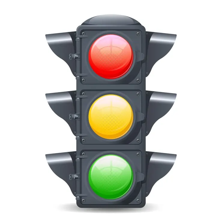 Status Indicators (Traffic Lights)
Functioning like traffic signals, these elements within visual management systems employ red, yellow, and green indicators to offer an instantaneous visual assessment of a project, task, or process status, clearly highlighting areas requiring attention.
Standardized Work Charts
As crucial manufacturing visual management tools, these visually document the most effective methods for executing a task, ensuring consistent execution and providing a clear visual reference for employees to follow established procedures.
Kamishibai Boards
These lean visual management audit boards utilize cards to visually track the completion of routine checks and audits, promoting adherence to standards and visibly indicating areas where audits are pending or issues have been identified.
Key Features of Visual Management Tools
Effective visual management tools are equipped with essential features designed to provide immediate, real-time insights into performance, transforming raw data into accessible and easily interpretable visuals for every member of the organization. These features streamline communication by presenting complex information in clear and concise formats.
Dashboards
These act as centralized visual hubs, consolidating diverse metrics and data points into a single, readily digestible interface for a comprehensive understanding of overall performance.
Performance Indicators (KPIs, SLAs, etc.)
Clearly displaying crucial metrics and targets, these enable teams to quickly evaluate progress toward objectives and understand their contribution to broader organizational goals.
Real-Time Data
Providing up-to-the-minute information ensures that all stakeholders operate with the most current data, facilitating timely and informed decision-making and proactive problem-solving.
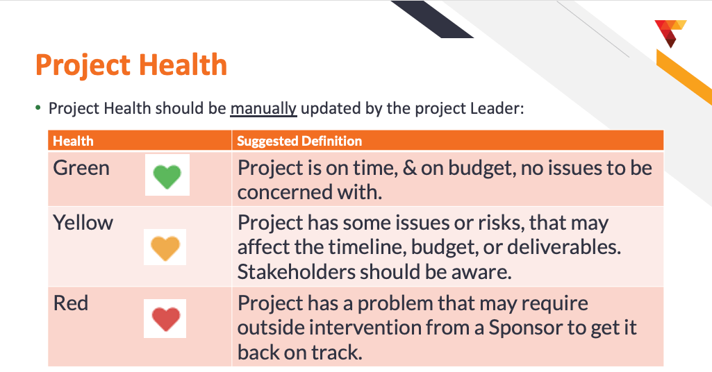
Color-Coded Visuals
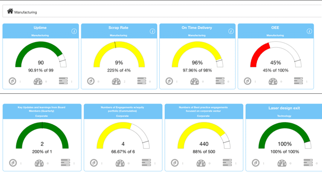
The strategic use of color (e.g., red, yellow, green) offers an immediate visual assessment of status or performance, swiftly highlighting areas and/or projects that are on track, require attention, or are facing challenges. An example from KPI Fire follows below:
Interactive Displays
Advanced tools allow users to engage directly with visual data, enabling deeper exploration through drill-down capabilities and data filtering, promoting a more thorough understanding of performance drivers.
Alerts and Notifications: These automated features flag any deviations from established targets or critical events, ensuring that relevant personnel are promptly informed of potential issues demanding attention.
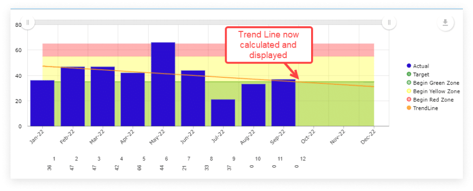
Trend Lines and Graphs: Visualizing data trends over time aids in identifying patterns, forecasting future performance, and evaluating the impact of implemented changes or interventions, supporting data-driven improvement initiatives.
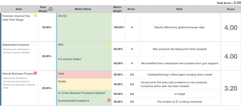
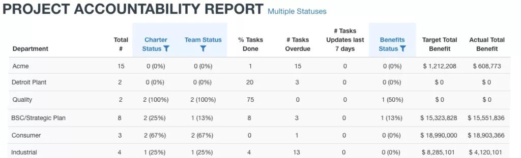
Performance Scorecards: These provide a structured visual summary of individual, team, or organizational performance against defined goals, fostering accountability and recognizing achievements. An example from KPI Fire follows below:
- Real-Time Collaboration Tools: Integrated features like chat functions, commenting threads, or shared viewing capabilities enable teams to discuss and act upon visual data collaboratively in real time, enhancing communication and accelerating issue resolution.
- Customizable Layouts: The flexibility to tailor dashboards and displays to specific team needs and information priorities ensures that the most relevant data is prominently displayed and organized for optimal comprehension.
- Data Integration: Seamless connectivity with various organizational data sources guarantees that visual management tools present a holistic and accurate view of performance, eliminating data silos and inconsistencies for more reliable insights.
Benefits of Visual Management Systems
By leveraging our natural inclination to process visual information efficiently, visual management systems act as a vital link between data and people within a Lean framework, employing intuitive visual cues to communicate succinct and accurate workplace information instantly, empowering better understanding and driving impactful improvements across key operational areas.
Enhanced Communication
Lean visual management fosters crystal-clear communication across teams, managers, and departments by translating complex data into easily understandable visual formats. This shared visual language ensures everyone has the same understanding of current status, goals, and challenges, promoting better collaboration and alignment on priorities.
Improved Accountability
Implementing a visual management system significantly increases accountability at all levels by making individual and team performance data transparent and readily visible. When progress and results are openly displayed, it encourages ownership of tasks and outcomes, motivating individuals and teams to take responsibility for their performance.
Faster Problem Identification and Resolution
Real-time tracking through visual management tools enables the swift identification of bottlenecks, inefficiencies, and quality issues as they emerge. The immediate visual representation of deviations from standards or targets allows for quicker diagnosis of problems and faster implementation of corrective actions, minimizing disruptions and improving overall efficiency.
Greater Engagement and Motivation
When employees can clearly see the impact of their work and the progress being made towards shared goals through visual management examples, they feel more connected and engaged. This transparency fosters a sense of ownership and contribution, leading to increased motivation and a greater commitment to achieving organizational objectives.
Data-Driven Decisions
The transparent and accessible nature of visual management systems reinforces the value of data-driven decision-making across the organization. By providing clear, visual insights into performance and trends, these systems empower leaders and teams to make informed choices based on facts rather than assumptions, leading to more effective strategies and better outcomes.
How to Create a Visual Management System (VMS)
Recognizing the brain’s superior processing speed for visual information, establishing an effective visual management system requires creating high-quality, relevant visuals that provide instant understanding, similar to how KPI Fire utilizes color-coded zones to clearly communicate progress against goals.
Step 1: Identifying Key Performance Indicators (KPIs)
The initial step in creating a VMS involves carefully selecting the right Key Performance Indicators (KPIs) that will be displayed. These metrics must directly reflect overarching business objectives and critical drivers of operational efficiency. The chosen KPIs should be measurable, relevant, and provide actionable insights into performance, allowing teams to understand their impact on strategic goals and identify areas needing attention.
Step 2: Designing the Visual Displays
Designing the layout of visual displays, such as dashboards, physical boards, or digital screens, is crucial for clarity and ease of understanding. Information should be organized logically, using consistent visual elements like charts, graphs, and color-coding to highlight key trends and statuses. The goal is to create displays that are intuitive at a glance, enabling users to quickly absorb essential information without requiring extensive interpretation.
Step 3: Data Collection and Integration
Reliable and timely data collection is fundamental to the effectiveness of a VMS. Integrating the system with existing technological infrastructure, such as ERP (Enterprise Resource Planning) or CRM (Customer Relationship Management) systems, allows for the automated retrieval of real-time data. This ensures that the visual displays are always up-to-date, providing an accurate reflection of current performance and enabling informed decision-making based on the latest information.
Step 4: Setting Up Feedback Loops
Establishing robust feedback loops is essential for monitoring the ongoing effectiveness of the VMS. Regularly collecting data on system usage and gathering feedback from users helps identify areas for improvement in the displays or the KPIs being tracked. Based on this data and feedback, adjustments should be made iteratively to ensure the system remains relevant, user-friendly, and continues to drive desired behaviors and outcomes.
Step 5: Training and Engagement
Comprehensive employee training is vital to ensure everyone understands how to interpret the visual data presented and how to take appropriate action based on the insights gained. Leadership plays a critical role in fostering engagement with the VMS by actively using the displays, encouraging discussion around the data, and recognizing teams and individuals who effectively utilize the system to drive improvements. This promotes a culture of visual literacy and data-driven decision-making.
How KPI Fire Supports Visual Management Tools
KPI Fire directly supports and enhances visual management tools by providing a centralized platform with specific features designed for seamless integration into the lean practices discussed. Its capabilities for real-time data visualization, goal alignment, and collaborative tracking amplify the effectiveness of visual communication for driving continuous improvement and operational excellence success.
Real-time Dashboards
KPI Fire’s real-time dashboards empower teams to monitor critical metrics and performance indicators through an intuitive, visual interface. These dynamic displays provide an up-to-the-minute snapshot of progress, enabling immediate identification of trends, successes, and areas needing attention for proactive decision-making.
Task and Goal Tracking
KPI Fire facilitates effective task and goal tracking by visualizing progress toward set objectives with clear, graphical representations. This visual overview ensures that everyone understands their responsibilities and how their individual contributions align with broader team and organizational goals, fostering accountability and focus.
Scorecards and Metrics Display
KPI Fire’s scorecards and metrics display features allow organizations to present performance data in a clear and concise visual format, making it easy to assess progress against targets. By offering customizable views and drill-down capabilities, teams gain deeper insights into performance drivers, supporting data-driven discussions and targeted improvement efforts.
Visual management tools, such as the real-time dashboards and balanced scorecards offered by platforms like KPI Fire, are not just about pretty charts; they are about transforming raw data into actionable intelligence. This matters because it empowers teams to self-manage, identify bottlenecks instantly, and make proactive adjustments that directly impact the bottom line. By making performance transparent and accessible, these tools foster a culture of continuous improvement where everyone is aligned, accountable, and driven to optimize efficiency.
KPI Fire stands out as a powerful enabler of these critical visual management practices. Its integrated features for real-time tracking, collaborative goal-setting, and crystal-clear data visualization provide the necessary infrastructure for organizations to truly embrace a lean, visually-driven approach. Ready to unlock the power of visual management and drive tangible results in your organization? Request a Demo today to see how KPI Fire can revolutionize your performance management.


